 "SWITAWI" (switawi)
03/31/2016 at 10:59 • Filed to: None
 1
1
 13
13|
"SWITAWI" (switawi)
03/31/2016 at 10:59 • Filed to: None | 1
| 13 |
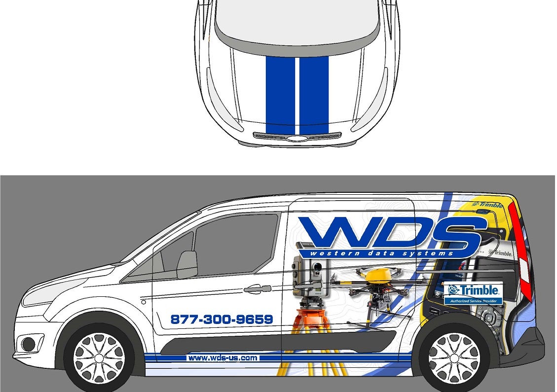
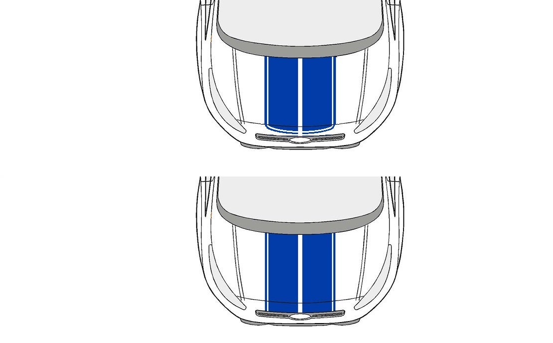
I just purchased a new (unsold) 2015 Ford Transit Connect XLT LWB for the company I work for with the idea that we are going to offer a mobile repair/pickup service for our customers.
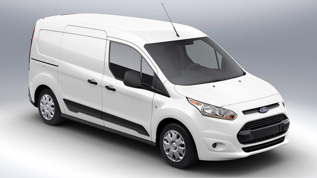
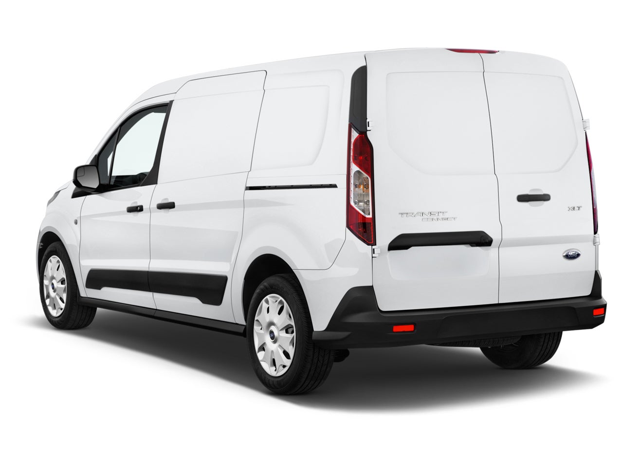
It will be fitted with an Adrian Steel partition and workbench (originally intended for mobile locksmith work) immediately behind the front seats leaving the rear pretty wide open. There are no windows behind the front doors so it lends itself perfectly to a vinyl wrap which I am arranging for. The powers-that-be agreed to a partial (back-half) wrap due to the cost compared to a full wrap, but the fact that the little van would just be presenting a bald white face going down the road really nagged me. The whole point is to get attention, right?
So I’m thinking...
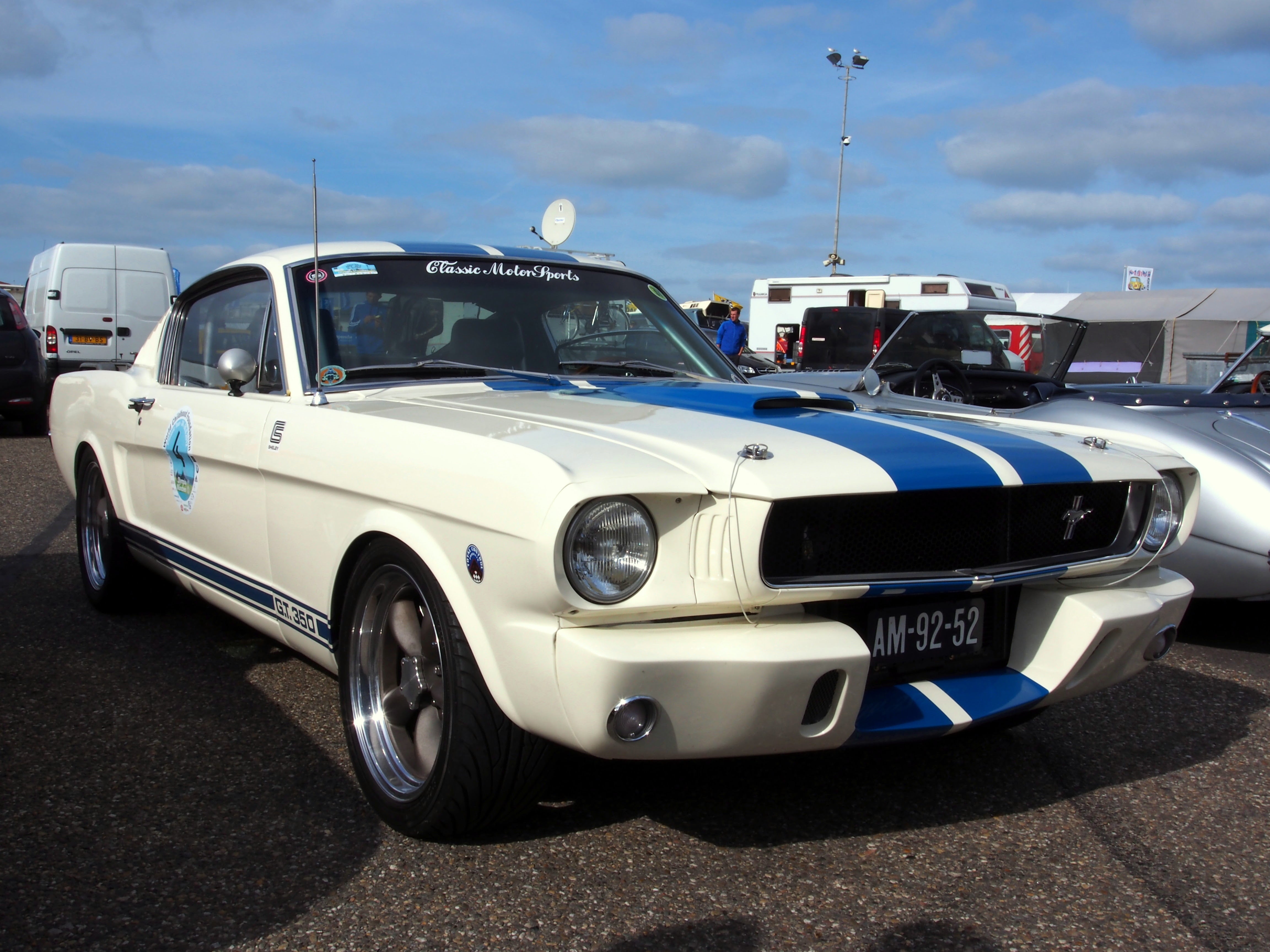
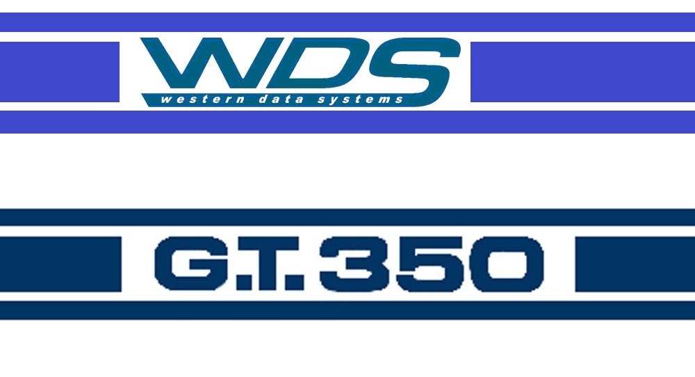
Our corporate logo color is very blue, almost like a hyperlink blue...
The van
is
a white Ford...
This practically writes itself, doesn’t it?
So I presented my idea to the vinyl graphics designer with some rough MS Paint representations...
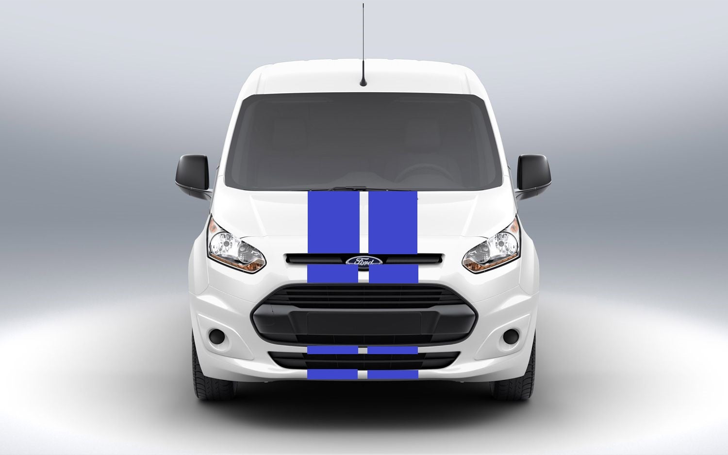
The graphics guy got way more excited than I thought he would. He said it bothers him as well when there’s nothing at the front to draw the eye to a vehicle with a partial wrap, and by the time the sides get someone’s attention (passing in the other direction) it’s too late to see what it said on the side panels and the rear is hard to decipher in the mirror. He saw this as a cool, very cost effective way to bring oncoming attention to his partial wrap customers. And he likes Mustangs, lol.
Thoughts?
Criticisms?
Laughter?
The floor is open...
11am CST Update :
Thanks to everyone for the overwhelmingly positive responses!
We’re hashing design details now. I made it clear we want the hood stripes to extend to the rest of the white bodywork down the front like my original front end image above. We’re going to have the company web address placed in the rocker panel stripe on the door. We’re also shuffling around some of the side panel image work. Waiting on the rear door image.
 $kaycog
> SWITAWI
$kaycog
> SWITAWI
03/31/2016 at 11:02 |
|
I like it!
 Bob Loblaw Made Me Make a Phoney Phone Call to Edward Rooney
> SWITAWI
Bob Loblaw Made Me Make a Phoney Phone Call to Edward Rooney
> SWITAWI
03/31/2016 at 11:02 |
|
Don’t know why you’re asking, this is a no brainer!
 Steve is equipped with Electronic Fool Injection
> SWITAWI
Steve is equipped with Electronic Fool Injection
> SWITAWI
03/31/2016 at 11:03 |
|


 Chinny Raccoon
> SWITAWI
Chinny Raccoon
> SWITAWI
03/31/2016 at 11:20 |
|
It’s like the inverse of the Sportvan.
 OpposResidentLexusGuy - USE20, XF20, XU30 and Press Cars
> SWITAWI
OpposResidentLexusGuy - USE20, XF20, XU30 and Press Cars
> SWITAWI
03/31/2016 at 11:23 |
|
Do. It.
 Svend
> SWITAWI
Svend
> SWITAWI
03/31/2016 at 11:26 |
|
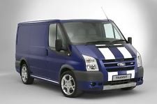
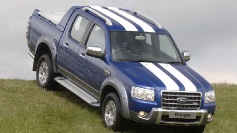
ST stripes have always worked well on the Ford range.
 RallyWrench
> SWITAWI
RallyWrench
> SWITAWI
03/31/2016 at 12:11 |
|
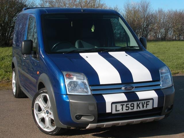
There is a fine tradition of white Ford vans with blue graphics.
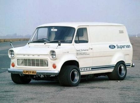
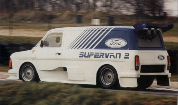
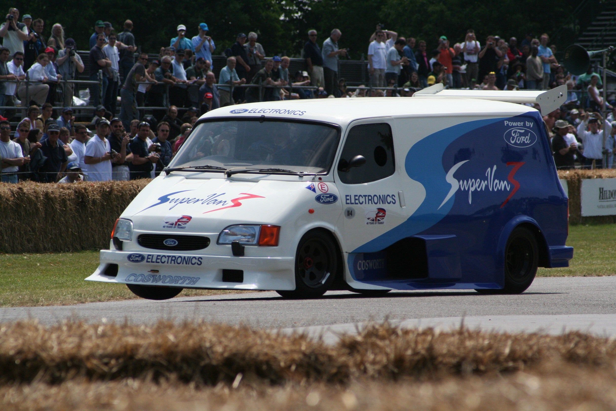
So yes, you should do it.
|
Svend
> SWITAWI
03/31/2016 at 13:06 |
|
To go with the narrow-wide-narrow stripes along the lower valence with the top one bringing the bonnet stripe into a final point rather than disappearing into the grille with no continuation below it.
|
SWITAWI
> Svend
03/31/2016 at 13:38 |
|
We bounced the idea around the office and looked up all kind of pictures, but in the end the majority liked the classic LeMans style of just two wide stripes without any accompanying narrow stripes alongside or any of the offset/off-center designs. Just like Briggs Cunningham and Peter Brock intended. Yeah, I had to explain myself after that comment, lol.
I’m also considering what happens if our straight-laced boss disapproves. I don’t think he’s going to ‘ get it ’. Fingers crossed...
 Stapleface
> SWITAWI
Stapleface
> SWITAWI
03/31/2016 at 14:07 |
|
Your side graphic is way too busy. I have no idea what I'm looking at, so to me it looks like a jumbled mess. While pictures are nice, wouldn't a logo and bullet points on what your company does make more sense?
|
SWITAWI
> Stapleface
03/31/2016 at 14:18 |
|
Salient points, and I thought it was busy as well. Things are being re-sized so there’s less overlap.
The bullet point idea came up early but sort of fell by the wayside. 90% of the public is gonna have to look up what we do anyway. This is a pickup-and-deliver repair service for customers which are professional surveyors, GIS users, and engineering firms in the greater San Antonio area.
Once we get the basics refined I’m bumping it up the chain and I’m sure they’ll want some changes before the $$$-in-charge gives an approval. We may yet get a tagline on there somewhere. Maybe over the phone number on the door and on the rear door. Still waiting to see the first pass on the rear...
 just-a-scratch
> SWITAWI
just-a-scratch
> SWITAWI
03/31/2016 at 14:58 |
|
To my eye, the beauty of the stripes is the simplicity. It catches the eye without being overwhelming. I also think that if kept simple it would make sense to extend the stripes all the way over the top also.
However, with the details on the sides, it's a lot to take it. I think it's too much.
 R0AD T0 N0WHERE
> SWITAWI
R0AD T0 N0WHERE
> SWITAWI
05/08/2016 at 16:42 |
|
Sorry I’m late to the party, But yes, the graphics are a bit over kill, but hey you only go around once and we’ll prob end up with something “busy” looking on our TC.